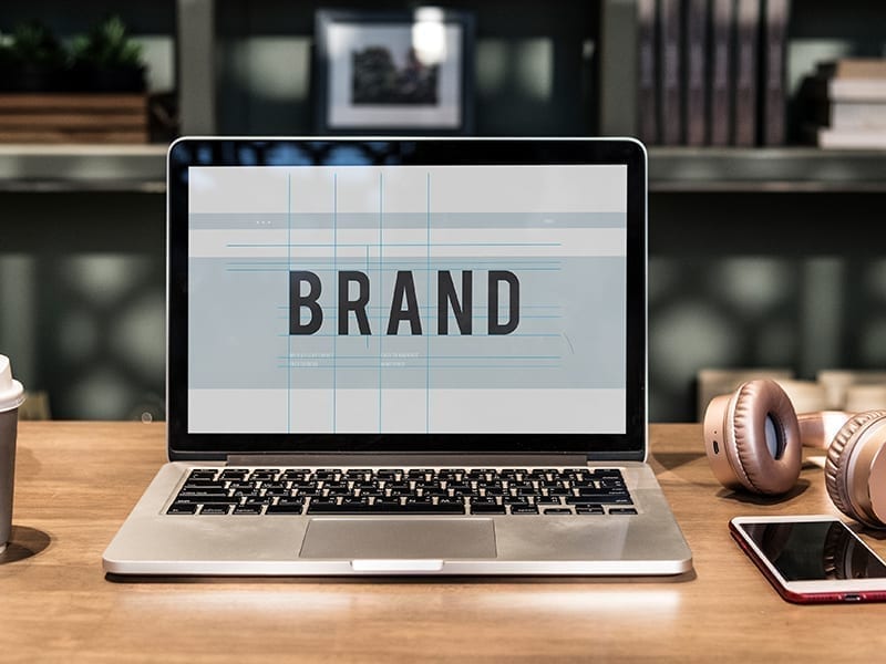
A beautifully designed visual identity doesn’t just support a brand, it elevates it. From your logo to website and social media layout to pitch deck, the visual appeal created by graphics, illustrations, fonts, and design elements can really help solidify imagery that will become synonymous with your brand. This visible component of branding is not just a useful asset, but a prerequisite in today’s day and age.
Designer Pallavi Nopany has found the perfect way to create brand visuals and communication with careful thought and intention under her namesake brand. In conversation with TC46, she shares how vital designs are for all your branding purposes, and a basics guide for all non-designer entrepreneurs, small business owners and business heads to better work in syn with their design teams.
Building A Brand Identity: The Positive Impact Of Using Professional Designs
A brand identity exercise is more than the sum of its parts when it comes to the deliverables mentioned in a contract. However, the very basic deliverables would be:
- A logo, which is a combination of a wordmark and an optional symbol. (There may be a monogram as well in addition to this).
- A colour palette
- A font kit, including the instruction on which fonts to use for headers and body copy.
- Basic guidance on imagery for catalogue photographs.
I usually also include basic stationery such as an invoice in an excel format, a visiting card, a letterhead and an envelope. All of the above are included in a brand manual that tells you how to use these components, and also how to avoid using them.
The next phase could be creating a strategy for social media, writing the content for the website, getting the photography done, and then the layout designs. It helps to have an open keynote or PPT template designed with 10 slides that the client can edit themselves. But beyond the deliverables, an agency who is doing this for you will help you come up with a visual theme that creates certain intentional perceptions.
For example, what is your brand’s personality? Is it friendly, humorous, sarcastic, delicate, straightforward, conversational etc? How weighty are each of these adjectives? There are explicit and implicit ways to do this, in the choice of fonts. For example, that may be delicate, fluid, or old-school.
How much of the above should you get professionally designed? Well, that depends! How many people will be interacting with your brand without you present in that room? If the entrepreneur is present, then they are all the brand. This is especially true for a smaller service providing agency such as a boutique legal firm. However, when the reach goes beyond your presence, people perceive your brand’s trustworthiness, organisation and credibility on the basis of the professionalism applied in the communication. So then it’s time to invest in these.
Some Inexpensive Design Tools That You Can Get For Your Team
- For websites, Shopify, Squarespace, Wix, are quite inexpensive and look professional
- For social media, one could create designs, including social media posts and even animations on Canva
- For editing photos, Snapseed by Google
- For other basic web-based creatives, Adobe XD is pretty inexpensive since it is new now.
- Sketchbook pro for illustration
Zeroing In On Your Designer: How To Know The Good From The Average When Hiring
- They should have a website which is professional looking. If they cannot organise their own information, then it’s unlikely that they can organise yours.
- They should also give you a contract with their process and terms clearly outlined.
- One should also try and gauge whether they have too many projects at hand, and whether your project will be one amongst many, or handed down to an intern, which is not desirable.
- Last but not least, see whether they get you as a person. Because a lot of the culture of an organisation is actually an extension of the founder. And these subtle things can only come through if they are able to pick it up. This you will know through conversation with them.
In my case, for the projects that I do want, I would invite the client to my home, have a meal or a coffee with them, and show them my work. I would create an informal setting so we both can know each other to see that we can be friends. For me this is important, and then the work is fun, where you can collaborate with your client to create something unique with trust and experimentation.
As for when I hire talent, what I would look for is the ability of this designer to present and organise information and while doing this, to bring out a certain personality. For example, while being able to illustrate is great, it’s not a primary skill in order to present and organise information. It’s very important to work with layouts and typography, and for this, I always like to see some web and publication projects that the individual or the agency has worked on.

